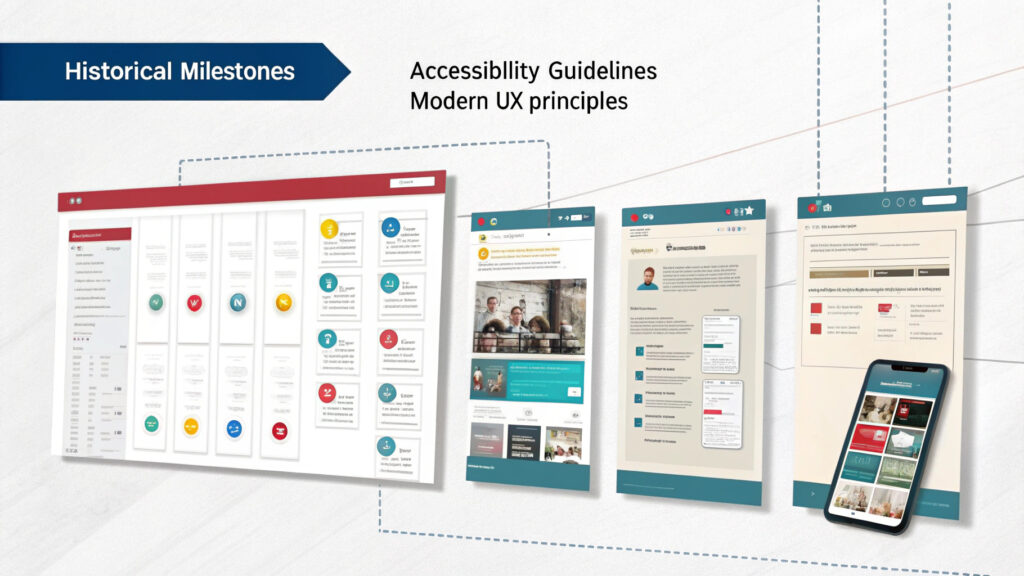
Let’s talk about a topic that makes some UX designers squirm in their ergonomically designed office chairs: Accessibility in UX. Now, it’s not because they’re heartless UI monsters who enjoy depriving certain users of a delightful digital experience. Oh no. It’s just that designing for all can be, well, a little challenging.
So, what is Accessibility in UX, and why should we care? Simply put, it’s about making sure your shiny new app or website doesn’t turn into a digital labyrinth for persons with disabilities. It’s about creating an Accessible UX Design that is usable for everyone.
Now, I know what some of you are thinking. “But my designs are already flawless! They sparkle with the intensity of a thousand suns and are as intuitive as breathing!” Well, kudos to your confidence, maestro, but even a seemingly perfect design can overlook the needs of those with disabilities.
Let’s get a little deeper into the rabbit hole of Accessible UX Design. Imagine, if you will, a user who is color blind. Your app, with its vibrant use of reds and greens, may look like a Picasso to you, but to them, it’s closer to a toddler’s finger painting. The key here is to use color contrasts effectively, making your UX design accessible even to those who view colors differently.
And what about those with motor skill difficulties? Tiny buttons and links that require the precision of a neurosurgeon aren’t exactly user-friendly. In fact, they can cause enough frustration to make users abandon the ship faster than rats from a sinking vessel. So, let’s size up, folks. Bigger interactive elements and more space around them can make navigation a breeze for everyone.
Then there are those with hearing impairments. If your app relies heavily on audio cues or instructions, you might be leaving them in the proverbial dust. Incorporating visual cues and subtitles in your Accessible UX Design can save the day here, ensuring that no user is left behind.
Of course, let’s not forget about those who rely on screen readers. Adding alt-text to images, using appropriate headers, and avoiding jargon like it’s the plague can make your content accessible for screen reader users. It’s a small step that can make a huge difference.
So, is all this effort worth it? Absolutely. Accessible UX Design isn’t just about being inclusive (although that’s a pretty fantastic reason on its own). It’s also about reaching a wider audience, reducing legal risks, and improving SEO. Consider it a win-win situation.
Now, before you start hyperventilating at the thought of all these requirements, take a deep breath. Accessibility doesn’t mean you have to compromise on aesthetics or innovation. It’s about finding the sweet spot where form, function, and inclusivity meet.
To wrap it all up, designing for all may seem like climbing Mount Everest in flip-flops. But with a little empathy, understanding, and a willingness to step out of your comfort zone, you can create an Accessible UX Design that’s not just usable, but enjoyable for everyone. So, let’s put on our thinking caps and design a digital world that’s truly inclusive. After all, everyone deserves a slice of the UX pie, don’t they?


