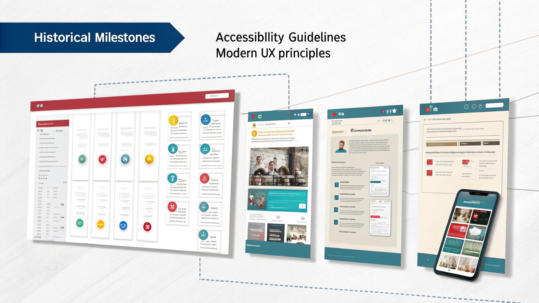
When you tap a link or button on your phone, you probably don’t give much thought to the size of the clickable area beneath your fingertip. Yet, the history of these “tap targets” is a rich tapestry of evolving user needs, device capabilities, accessibility requirements, and even search engine optimization (SEO) considerations. This blog post takes you on a journey—from the earliest days of user interface (UI) design to the modern era of comprehensive digital accessibility—to show why tap targets went from being an afterthought to a foundational UX principle.
Table of Contents
- 1 1. Early Influences: Before “Tap Targets” Had a Name
- 2 2. The Smartphone Revolution: Tap Targets Gain Center Stage
- 3 3. Moving Online: Tap Targets in Web Development
- 4 4. Formalizing Accessibility: WCAG Brings Tap Targets to the Fore
- 5 5. Why Tap Targets Matter for Everyone
- 6 The Ongoing Legacy of Tap Targets
- 7 Frequently Asked Questions (FAQ)
- 7.1 1. What is a tap target?
- 7.2 2. Why are tap targets important for accessibility?
- 7.3 3. How do tap targets influence mobile SEO?
- 7.4 4. What are the key WCAG guidelines for tap target size?
- 7.5 5. Are there recommended minimum sizes for tap targets?
- 7.6 6. What if I have limited screen space or complex layouts?
- 7.7 7. How do I test if my tap targets are big enough?
- 7.8 8. Do larger tap targets affect design and aesthetics?
- 7.9 9. Can tap targets benefit desktop users, too?
- 7.10 10. Where can I learn more about designing accessible tap targets?
1. Early Influences: Before “Tap Targets” Had a Name
1.1. Fitts’ Law and the Birth of Clickable Areas
Long before the term “tap target” was coined, human-computer interaction (HCI) experts studied Fitts’ Law—a model describing how the time required to move to a target area is related to the target’s size and distance. Originally applied to physical controls like levers and switches, Fitts’ Law quickly influenced early computer interface design. Larger on-screen buttons were easier to click with a mouse; smaller, densely packed elements caused errors or slow navigation.
1.2. Stylus-Based Devices
In the 1990s and early 2000s, personal digital assistants (PDAs) like the Palm Pilot and early Windows CE devices introduced stylus-based touchscreens. Although precise, stylus input also highlighted the importance of well-sized “hit areas,” as small, cramped UI elements led to user frustration and mis-taps. Even if the language of “tap targets” wasn’t commonplace, the seeds of larger, carefully spaced controls were sown during this era.
2. The Smartphone Revolution: Tap Targets Gain Center Stage
2.1. Apple and the 44pt Rule (2007)
The real shift began in 2007 with the introduction of the original iPhone. Suddenly, fingers replaced mice and styli for everyday interaction. Apple’s Human Interface Guidelines (HIG) recommended a minimum 44pt x 44pt tap area to accommodate the average fingertip. This was likely the first time “tap targets” became a specific term designers actively considered, as developers migrated from designing for precision cursors to designing for broader, less accurate finger presses.
2.2. Android and the 48dp Standard
Hot on Apple’s heels, Android popularized a comparable best practice: 48dp x 48dp as a minimum size for interactive elements. These guidelines were heavily influenced by user experience research showing that even small differences in size (44pt vs 48dp) could reduce accidental taps and improve user satisfaction.
3. Moving Online: Tap Targets in Web Development
3.1. The Rise of Mobile-Friendly Websites
As smartphones spread globally, mobile web browsing soared. Developers who once designed primarily for desktop screens had to adapt websites for a variety of phone and tablet sizes. Early on, websites that weren’t optimized for mobile led to:
- Pinch-and-zoom fatigue
- Cramped links and buttons
- Frustrated users who struggled to tap tiny elements
3.2. Google Steps In (2015)
In April 2015, Google introduced its “mobile-friendly” update, affecting search rankings on mobile devices. Websites with tap targets that were too small or too close together received warnings in Google Search Console and could rank lower in mobile search results. Overnight, tap targets became not just a usability concern but also an SEO priority. Web designers now had a compelling incentive to resize and space out interactive elements.
4. Formalizing Accessibility: WCAG Brings Tap Targets to the Fore

4.1. WCAG 2.1 and the AAA Recommendation
The Web Content Accessibility Guidelines (WCAG) formalize best practices for making digital content accessible to people with disabilities. In WCAG 2.1 (2018), the first explicit mention of tap target size appeared in Success Criterion 2.5.5: Target Size (AAA). Although listed at Level AAA (the highest, most rigorous standard), it signaled official recognition that adequate tap target sizing was vital for users with low vision, motor impairments, or conditions like tremors.
4.2. WCAG 2.2 Brings It to Level AA
Released as a draft and moving toward recommendation, WCAG 2.2 elevates target size requirements to Level AA under Success Criterion 2.5.8: Target Size (Minimum). This shift means that tap targets aren’t merely a best practice but a core requirement for most standard accessibility conformance.
Key Points of WCAG 2.2’s Criterion:
- Default recommended size around 24 x 24 CSS pixels (slightly smaller than Apple/Android but with certain exceptions).
- Emphasis on spacing and grouping so users don’t accidentally tap the wrong element.
- Acknowledgement of practical exceptions, e.g., inline text links in paragraphs.
5. Why Tap Targets Matter for Everyone
5.1. Accessibility for Motor Impairments
For individuals with Parkinson’s, arthritis, or any condition affecting fine motor control, small tap targets can be nearly impossible to hit consistently. Increasing target sizes lowers the barrier and improves autonomy online.
5.2. Usability for All Ages & Abilities
Even those without diagnosed disabilities benefit from bigger buttons and clear spacing—especially on small phone screens. Whether it’s a child using their first tablet or someone with large fingers, bigger targets reduce accidental taps.
5.3. Better SEO and Conversion Rates
As noted, Google ranks mobile-friendly sites higher, particularly if they adhere to recommended target sizes. Additionally, larger, well-spaced call-to-action buttons (e.g., “Buy Now”) tend to yield higher conversion rates because they’re easier to tap.
The Ongoing Legacy of Tap Targets
From the rudimentary guidelines of early desktop design to the formalized requirements of WCAG 2.2, tap targets have evolved alongside the technologies we use daily. Once a footnote in general usability, they are now a pillar of inclusive design—and a recognized factor in SEO rankings.
Whether you’re building a mobile app, refining a website, or enhancing an enterprise application, well-designed tap targets make experiences easier for everyone. In this sense, the story of tap targets is a testament to how small design details can profoundly impact accessibility, user satisfaction, and even business metrics. Embracing them isn’t just about meeting standards or pleasing Google; it’s about creating an inclusive, intuitive digital world—one tap at a time.
Further Reading & Resources
- WCAG 2.2: Target Size (Minimum)
- Apple Human Interface Guidelines
- Google Material Design
- Fitts’ Law Explained
- Google’s Mobile-Friendly Test
Frequently Asked Questions (FAQ)
1. What is a tap target?
A tap target is the area of an on-screen element—like a button or link—that responds to a user’s tap or click. In touchscreen devices, tap targets need to be large enough so people can accurately tap them with their finger.
2. Why are tap targets important for accessibility?
Many users have limited dexterity or motor impairments (e.g., tremors, arthritis). If a target is too small or too close to other elements, they can’t tap it accurately. Larger tap targets ensure that everyone, regardless of ability, can interact with digital content comfortably.
3. How do tap targets influence mobile SEO?
Since 2015, Google’s mobile-friendly guidelines factor in tap target size. If your website has small or closely spaced tap targets, Google may label it less mobile-friendly—potentially impacting its search ranking on mobile devices.
4. What are the key WCAG guidelines for tap target size?
- WCAG 2.1 introduced Target Size at Level AAA (SC 2.5.5).
- WCAG 2.2 now includes Target Size (Minimum) at Level AA (SC 2.5.8).
This means you should provide sufficiently large or well-spaced tap targets to meet mainstream accessibility requirements.
5. Are there recommended minimum sizes for tap targets?
- Apple iOS: Typically ~44pt x 44pt.
- Android: ~48dp x 48dp.
- WCAG 2.2 (AA): ~24px x 24px minimum with recommended spacing (though exact measures depend on the context and exceptions).
6. What if I have limited screen space or complex layouts?
WCAG 2.2 allows exceptions where space is constrained. You can use additional spacing between smaller elements or rely on contextual cues (like clear labels or visual feedback). The goal is to ensure users can distinguish and tap each target easily, not necessarily to enforce a one-size-fits-all approach.
7. How do I test if my tap targets are big enough?
- Use real devices: Emulators can be helpful, but actual taps on physical screens reveal real-world usability issues.
- Google’s Mobile-Friendly Test: Checks basic issues like closely spaced elements.
- User testing: Feedback from actual users (particularly those with motor impairments) provides valuable insights.
8. Do larger tap targets affect design and aesthetics?
Good design balances visual appeal with usability. Larger buttons can often improve aesthetics by providing cleaner layouts and more white space. Most modern design frameworks encourage generous spacing, so it usually aligns with both accessibility and a polished look.
9. Can tap targets benefit desktop users, too?
Absolutely. While they’re most critical on touch devices, larger clickable areas also help desktop users with motor difficulties. Additionally, clearer, larger targets improve overall user experience for anyone using a mouse or even a trackpad.
10. Where can I learn more about designing accessible tap targets?
- WCAG 2.2: Target Size (Minimum)
- Apple Human Interface Guidelines
- Google Material Design Guidelines
- Microsoft UX Guidelines