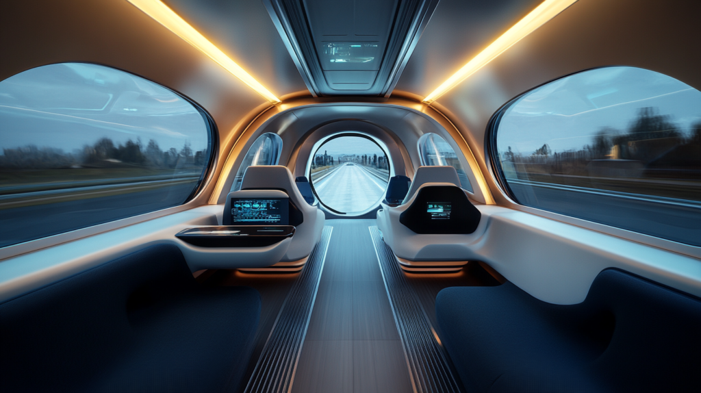
In the realm of future transportation, the Hyperloop stands out not merely as a beacon of ultra-fast travel but as a testament to the evolving relationship between technology and the human experience. The integration of User Experience (UX) in this futuristic mode of transportation isn’t an afterthought; it’s a foundational element crucial for its success. After all, what’s the point of ultra-fast travel if the journey leaves passengers too frazzled to appreciate the time saved?
The Hyperloop, conceived by Elon Musk, aims to revolutionize transport by propelling pods through vacuum tubes at speeds that overshadow conventional high-speed trains. Yet, achieving such technological feats is only half the battle. The other half is ensuring the Hyperloop UX design makes the journey user-friendly. Ensuring passengers are comfortable and reassured while traveling at speeds of up to 700 miles per hour is essential for widespread adoption.
Hyperloop UX spans a range of considerations, from a seamless booking interface to the physical comfort within the pods. Every touchpoint must be intuitive, ensuring the Hyperloop comfort design prioritizes ease and reassurance. Convincing the public to embrace this innovative transport method means overcoming skepticism and fear associated with being part of a high-speed experiment.
The booking process exemplifies the need for a frictionless experience. In today’s world, where convenience is paramount, securing a spot on a Hyperloop should be as straightforward as ordering a coffee through an app. This means minimal clicks, transparent pricing, and real-time updates, all designed to put control back in the user’s hands.
Inside the pod, the Hyperloop comfort design takes center stage. The interior must balance futuristic aesthetics with the comforting aspects of traditional transport. Addressing the unique challenges posed by the Hyperloop’s speed, maintaining a comfortable internal environment will be key. Innovations in lighting, materials, and sound could transform the pods from daunting tubes into relaxing cocoons.
Accessibility is another critical component of Hyperloop UX. The aim is to create a system that is universally intuitive, catering not only to individuals with disabilities but also to those less familiar with advanced technologies. Designing a user interface that feels natural to both tech enthusiasts and less tech-savvy individuals is crucial for inclusivity.
Safety information is paramount in ensuring passengers feel secure. Providing clear, accessible information on safety procedures is essential, especially in a system as novel as the Hyperloop. Reassuring passengers about their safety, despite the high speeds, is crucial for confidence in the system.
The role of UX in the Hyperloop extends beyond the passenger experience to consider its impact on cities, the environment, and perceptions of distance and time. A comprehensive UX strategy will ensure the Hyperloop integrates smoothly into our lives and societies.
As we advance towards this future, the importance of Hyperloop UX and comfort design in making these technologies not only usable but desirable is clear. It’s about creating a future where speed, comfort, and convenience are harmonized through user-centered design, making the transition from science fiction to science fact feel not only exciting but natural.
In essence, the integration of UX in the Hyperloop and future transportation systems is about more than aesthetics or functionality. It’s about crafting an experience so intuitive and reassuring that it becomes an indispensable part of our lives, turning the futuristic into the familiar and the daunting into the desirable. This is the journey that lies ahead for Hyperloop UX and comfort design.


