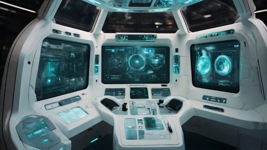
Well, welcome to the fascinating world where UX meets space technology. Here, we aren’t just sketching mobile apps or designing software for desktops. No, no, we’re charting the final frontier: space. A place where the user experience is less about convenience and more about surviving in an environment that, frankly, isn’t too keen on human survival.
In space, every small detail matters! A misplaced button or an ambiguously labeled toggle switch could potentially lead to disastrous consequences. And God forbid, if the coffee maker isn’t user-friendly, we might have a caffeine-deprived astronaut on our hands. The horror! So, we’re talking about a whole new level of UX in space technology, where the stakes are as high as the stars themselves.
Designing for astronauts is an intense affair. The user base is not your average consumer but highly trained professionals who operate in an environment that is, to put it mildly, a bit challenging. The UX in space technology isn’t about creating a ‘pleasant’ user experience; it’s about designing interfaces that are intuitive and can be operated even under extreme conditions. Imagine trying to navigate a touch screen with bulky astronaut gloves. Still think your smartphone is too big?
The role of UX in space technology extends to creating systems that help astronauts carry out their mission without any hiccups. Yes, there’s a lot of technical jargon and complex machinery involved. But at the end of the day, these are tools used by humans (albeit super-smart, space-traveling ones). And the golden rule of UX design? Make it simple for the user.
Now, let’s take a breath and talk about something a little less dramatic: space travel. With companies like SpaceX and Blue Origin making interstellar tourism a reality, the realm of UX in space technology will soon extend to average Joes like you and me. And trust me, there’s nothing average about designing for space tourism.
As space travel becomes more commercial, the demand for a seamless and comfortable user experience will skyrocket (pun intended). UX designers will need to create interfaces that are intuitive yet sophisticated, ensuring that passengers can operate them easily while feeling like they are indeed embarking on a journey to the stars. Remember the first time you used a smartphone? Imagine that, but in zero gravity.
UX in space technology also entails a focus on safety. In the confined spaces of a spacecraft, clear instructions and easy-to-use controls are not just about convenience, but also about ensuring that safety procedures are followed correctly. Misunderstand a safety instruction in space, and you might find yourself floating off into the infinite yonder.
So, UX in space technology isn’t just about designing cool-looking spacecraft consoles or creating the next ‘Instagram’ for space selfies. It’s about creating experiences that are easy to understand, simple to use, and effective in their function. It’s about ensuring that the brave men and women who venture into space can focus on their mission, rather than trying to figure out which green button to press.
In conclusion, the role of UX in space technology is a blend of high stakes design, safety, and the humanization of complex systems. As space travel evolves, so will the challenge for UX designers. But hey, if it were easy, it wouldn’t be nearly as much fun. After all, as a wise man once said: “Space is hard.” But with the right UX, it can at least be a little easier to navigate.


