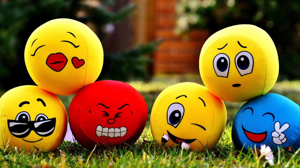
Let’s embark on a fascinating journey, shall we? Today, we’re diving headfirst into the enthralling world of Emotional UX Design. It’s not just about creating a pretty interface for users; it’s about creating a connection, a feeling, a personal experience. I know it sounds like we’re trying to be matchmakers, and in a way, we are. We’re just matching users with digital experiences, rather than cheesy pick-up lines.
Emotional UX Design is like the secret ingredient in your grandma’s favorite recipe. You might not know exactly what it is or how much of it she uses, but you know it’s there because it makes everything taste so much better. It’s the emotional ties that users form with your product that keep them coming back for more, that turn them into loyal advocates.
Now, don’t get it twisted. Emotional UX Design isn’t about manipulating users’ feelings. It’s about understanding them, empathizing with them, and designing experiences that resonate with their emotional needs. Sure, it’s easier said than done, but then again, nobody said that being a UX Designer was going to be a walk in the park.
There’s a lot of talk about making user experiences intuitive, easy-to-use, and accessible. But how often do we talk about making them enjoyable, delightful, and emotionally engaging? Probably not as often as we should. That’s where Emotional UX Design comes into play. It’s not a nice-to-have; it’s a must-have. Because when you design for the heart, you’re designing for real people, not just users.
The question then arises, how do you design for emotion? It’s not like there’s an exact science to it. But the first step is always understanding your users. What are their needs, their frustrations, their desires? Once you have these insights, you can start to craft experiences that address these emotions.
For instance, if you know that your users are often stressed and looking for quick solutions, you might design a user experience that is straightforward and calming. On the other hand, if your users are looking for adventure and excitement, you might design an experience that is dynamic and engaging. It’s all about understanding the emotional context and responding to it.
Emotional UX Design is not just about the big moments but also the small ones. Those micro-interactions that make a difference, that make users feel seen and appreciated. A thoughtful error message, a playful loading animation, a personalized greeting. These might seem like small things, but they can have a significant impact on how users perceive and interact with your product.
But remember, Emotional UX Design is not a one-size-fits-all solution. What works for one user might not work for another. That’s why testing and iteration are key. You need to experiment, iterate, and refine your designs based on real user feedback. It’s not about proving that your design is right, but about learning what works and what doesn’t.
In conclusion, Emotional UX Design is about designing experiences that appeal to users’ hearts, not just their minds. It’s about creating a connection that goes beyond the screen, a connection that feels personal, genuine, and meaningful. So, let’s stop treating users like data points and start treating them like real people with real emotions. Because that’s what Emotional UX Design is all about.
So, folks, strap in and prepare for an exciting journey into the world of Emotional UX Design. It’s not always easy, but it’s always worth it. And remember, it’s not just about making users happy; it’s about making them feel. And isn’t that what all great designs aim to do?


