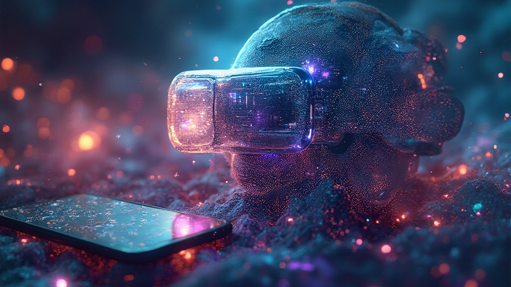
In the world of UX design, technology is a fickle mistress. Every now and then, she throws a curveball, and just when we think we’ve got the hang of flat design, we’re staring down the barrel of Holographic UX Interaction. I mean, why should we work with measly two dimensions when we can have three, right?
Holographic interfaces are not some sci-fi fantasy anymore, they are gradually transforming into reality. Cutting-edge technology, driven by advancements in augmented and virtual reality, is paving the way for a new era of 3D interaction in UX. There’s nothing like a fresh wave of technological innovation to keep us on our toes.
The core of Holographic UX Interaction is the creation of fully interactive 3D designs. These designs are essentially holograms that users can manipulate with gestures, voice commands, or even their gaze. Yeah, you heard it right, this is the stuff of Iron Man! But here’s the kicker, it’s not just for the superheroes, but for common users too.
The drive for Holographic UX Interaction is fueled by a desire for a more immersive and engaging user experience. Traditional 2D interfaces are so yesterday. When users can interact with a 3D holographic interface, they are not just observers, they become active participants. And let’s be honest, who wouldn’t want to feel like Tony Stark while going through their emails?
However, let’s not jump on the bandwagon too hastily. The transition to Holographic UX Interaction is not going to be all rainbows and unicorns. For one, designing for a 3D interface is a lot more complex than a 2D one. UX designers, who were once masters of the flat screen, are now faced with the challenge of essentially designing holographic space.
Then there’s the technological infrastructure. Implementing holographic interfaces on a large scale requires substantial computational power and advanced sensors. Will the average Joe’s laptop or smartphone be able to handle such demands? The jury is still out on that one.
Also, we need to consider the learning curve for users. While the prospect of Holographic UX Interaction is enchanting, the reality is users will need time to adapt to this new form of interaction. And if history has taught us anything, it’s that people don’t like change, especially when it involves learning new ropes.
Despite these hurdles, the journey towards Holographic UX Interaction is well underway. Major tech companies are investing in this next frontier of UX design. The dream of a fully interactive 3D interface is not so far-fetched anymore. The question is whether we, as UX practitioners, are ready to embrace this paradigm shift.
In the end, like every new technology, Holographic UX Interaction has its pros and cons. The potential for creating immersive and engaging experiences is immense. However, the road to achieving this is fraught with challenges. But isn’t that always the case with innovation?
So, buckle up, UX designers! Holographic UX Interaction is not just a futuristic concept; it’s the next big thing in the UX world. And whether we like it or not, we’ll have to adapt. Because as we all know, in the realm of UX design, adaptability isn’t just a fancy buzzword, it’s a survival skill. Now, who’s ready to feel like Tony Stark?


